
Stop Printing "Scan Me": How to Standardize Cosmetic QR Codes for Conversion
Confusion kills conversion. Our 2026 study reveals a landscape of confusion in beauty QR code design. Learn the 3 visual cues that train consumers to scan and buy.
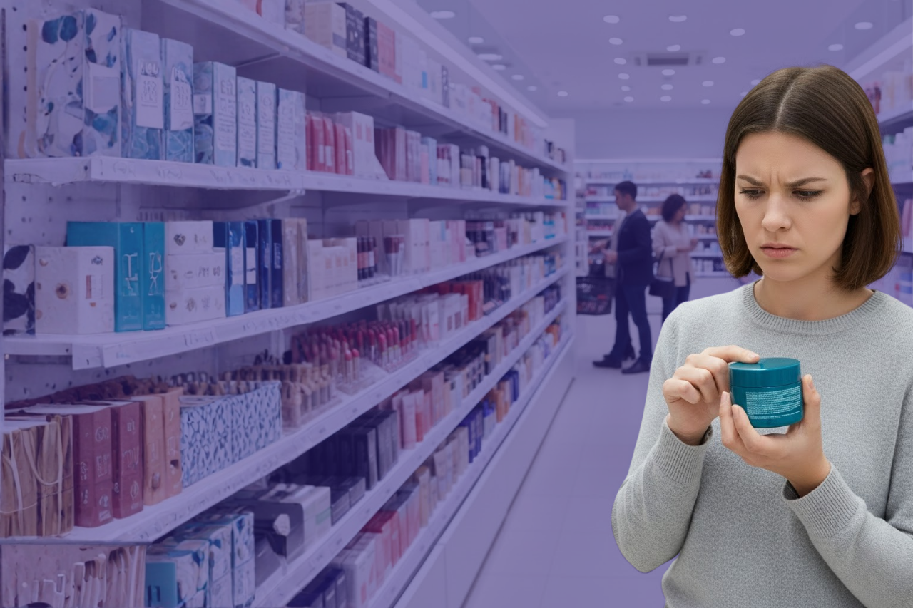
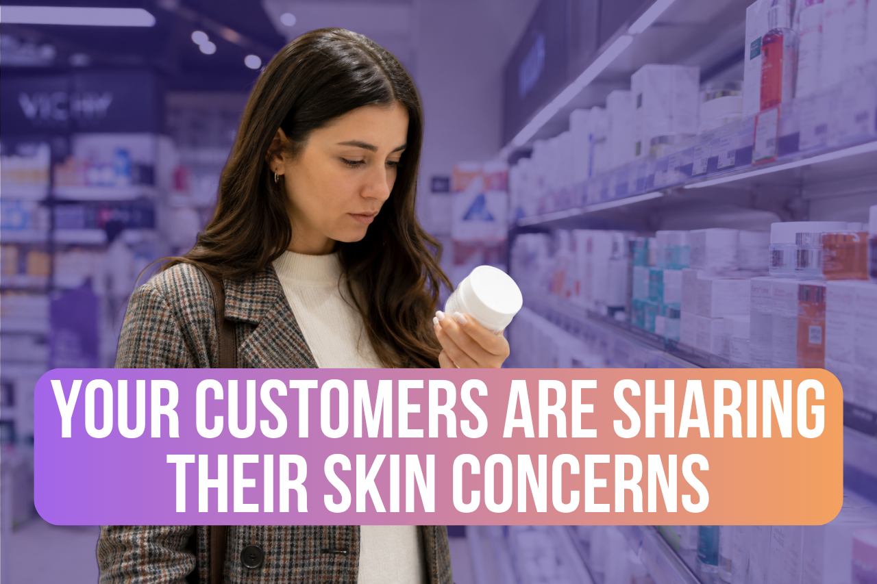
Walk down any beauty aisle today, and you will see a landscape of confusion. Brands are eager to print QR codes on their packaging, but they are failing to explain why a customer should scan them.
The "Tower of Babel" in Beauty Packaging
In our audit of 100 cosmetic brands, we found dozens of non-standardized phrases next to QR codes, ranging from the vague "Discover More" to "Sort your waste". There is no easy way for shoppers to guess what their benefit will be, leading to disappointment and meager traffic. Even worse, 25% of brands print codes with no text at all.
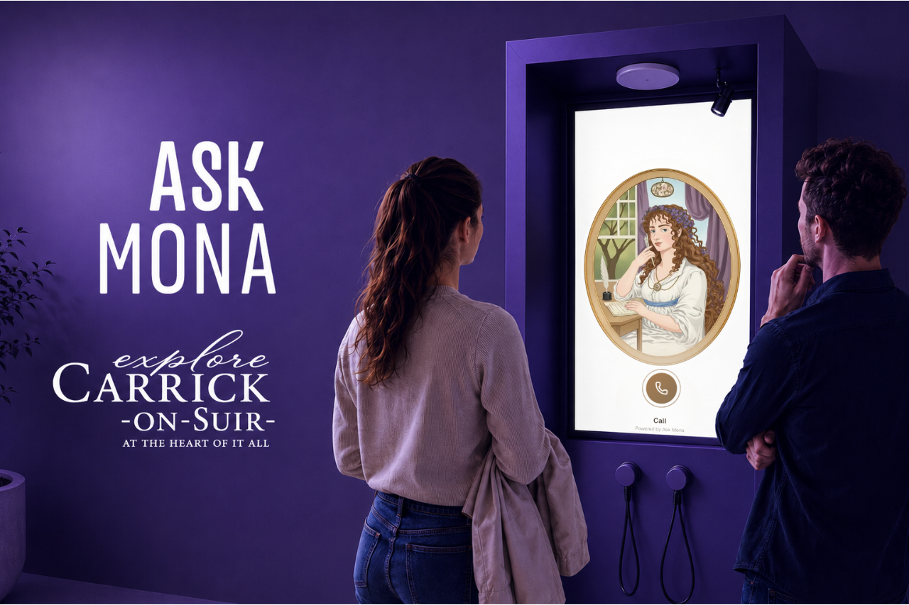
The "Ask Mona" Design Standard
To fix this broken User Experience, brands need a unified design language that signals intelligence and utility. We propose a standardized framework to boost scan rates:
- The Speech Bubble: Instantly indicates that a discussion is available, not just a static webpage.
- The Gradient: Signals the presence of Generative AI—implying the experience will be personalized, modern, swift, and multilingual.
- The "ASK!" Prompt: A clear, benefit-driven promise. It tells the user that any question is welcome and that they will receive a curated answer from the Brand.
The Network Effect
Scale matters. A brand that deploys this standard visual capability across its full lineup trains the public to recognize the service. By doing so, they leverage a powerful "network effect" of helpfulness, turning the packaging into an intelligent platform.

Get the visual design guide and see examples of good vs. bad execution from the biggest names in beauty.

Take the
next step